Barribal Artist Checklist
William Barribal
The following list supplied to us by the late Nigel Edwards (Edwardian Delights) Australia in 1999
This checklist is provided for the interest and information of collectors. It has been compiled over a period of several years, with inputs from many collectors and dealers, to whom our thanks.
The list is arranged in three sections –
– Non – Advertising Issues
– Advertising Issues (non-Theatrical)
– Theatrical Advertising issues
Within each section the cards are listed in alphabetic sequence of publisher (with anonymous issues at the end of the section). Within the publisher section – the cards are listed by card or series number – or by estimated chronological sequence where no numbers exist.
The dating of these cards has been derived from postal usage of both the cards themselves and from the work of other artists whose cards were published by the same companies. In many cases, especially where cards are rare, no estimate of date is feasible.
We make no attempt to value these cards. However, we do include a rarity factor, which collectors may regard as a guide to relative value. The rarity factor is shown in terms of an rating, with cards graded from RR to RRRRR. The more R’s shown – the harder to find this card is likely to prove. Any cards which carry no grading are considered as rating a single R – the easiest to find of Barribal’s postcard designs.
We must stress that this information is provided to assist collectors. We cannot accept any responsibility for the accuracy or completeness of information contained herein.
Additional information from collectors or dealers would be very welcome.
NON – ADVERTISING ISSUES
ALPHA (U.K.)
Only known cards are copies of original Inter Art issues, numbered 1006. At least two exist – IA 1588 (A British “Destroyer”), IA 2875 (D— It !) and IA 2878 (Hands Up).
B.K.WI. (Austria)
Austrian issues of various designs published by Carlton and James Henderson. Seen variously with German and with French titles. Also issued a series of six which were published in the UK by Valentine (see Valentine series.)
CARLTON (U.K.)
Two series, each of six cards. The first series was also published by James Henderson, in a series numbered 15644.and the second series was issued by BK of Vienna, with German titles.
Numbered 501 – 506 : – Five cards feature portraits of women – with no particular theme or style. The sixth(506) features a heart shaped vignette, with a head portrait of a naval officer surrounded by three women. First published – 1913.
501 . . . . . The Sunshine Girl
502 . . . . . Nothin’ Doing
503 . . . . . Waiting
504 . . . . . The Latest
505 . . . . . The Glad Eye
506 . . . . . One in Every Port
Note: – Considerable colour variation seen in these cards, especially 501
Numbered 538 – 543 : – All cards feature full length portraits of elegant women. First published – 1914.
538 . . . . . Shall I ?
539 . . . . . The Flapper
540 . . . . . Cheek
541 . . . . . Still Waiting
542 . . . . . Hope Deferred
543 . . . . . Out for the Evening
JAMES HENDERSON & SONS LTD. (U.K.)
One of the major publishers of cards designed by Barribal. This organisation seems to have absorbed the great majority (but not all) of the artist’s designs between 1912 and 1914.. Most of the cards were issued in sets of six, although one series (Barribal Heads) definitely comprises only four cards.
Note – advertising cards listed in advertising section
Series C1 (also seen with a series title – “The Vanities by Barribal” – on reverse) : – Five cards feature full length portraits of elegant women, set on a full colour background. The sixth (2513) is quite different – a circular vignette, set on white board, with head portrait of a woman.. First published – 1912. (Note – later re-issued as series 15643).
2513 . . . . The Beauty Spot
2514 . . . . The Jewel
2515 . . . . The Mirror
2516 . . . . The Powder Puff
2517 . . . . The Fan
2518 . . . . The Lorgnette
Series C2 : – Women’s heads on a white background. Low key colour – mainly red – on otherwise black and white designs. First published – 1912. (Note – later re-issued as series 15624, and also as series C8, without titles and with colour variations).
2519 . . . . Dorothy
2520 . . . . Mary
2521 . . . . Helen
2522 . . . . Kitty
2523 . . . . Nellie
2524 . . . . Maggie
Series C3 : – Portraits of elegant women – some full length- others head & shoulders. First published – 1912. (Note – later re-issued as series 15645, without titles and printed on a stippled board. Also re-issued as series C9 – no titles and slightly smaller portraits.).
2555 . . . . A Good Sport
2556 . . . . Something on Hand
2557 . . . . Miss Caprice
2558 . . . . A Ray of Sunshine
2559 . . . . Birdie
2560 . . . . A Brown Study
Series C4 : – Portraits of elegant women – no common theme or style. First published – 1912. (Note – later re-issued as series 15648, without titles.).
2604 . . . . The Favourite
2605 . . . . Pretty Polly
2606 . . . . Lady Disdain
2607 . . . . A Southern Star
2608 . . . . Wireless
2609 . . . . Found Out
Series C5 : – Head and shoulder portraits of women in elegant and flamboyant hats, set on a white background. First published – 1913. (Note – later re-issued as series 15464, usually (not always) without titles – but see notes below.).
2616 . . . . Ma Petite
2617 . . . . Silent Persuasion
2618 . . . . Eyes Right *
2619 . . . . True Blue
2620 . . . . Mystic Beauty
2621 . . . . Wearin’ o’the Green **
* – in series 15464, has been seen with the title, “Fancy Free”.
** – in series 15464, the <o’ > of the title becomes .
Series C6 : – (also seen with a title, “Head Studies” on reverse). Head and shoulder portraits of women in elegant and flamboyant hats, set on a white background. First published – 1913. (Note – also issued by MM of Vienna, without titles.).
2646 . . . . Fine Feathers
2647 . . . . Dainty & Demure
2648 . . . . Sweet Simplicity
2649 . . . . Little Miss Mischief
2650 . . . . In the Clouds
2651 . . . . Height of Fashion
Series C7 : – Varied portraits of elegant women – from full length to head and shoulder studies. First published – 1915.
2966 . . . . Hello Boys
2967 . . . . ‘Nuff Said
2968 . . . . And Very Nice Too !
2969 . . . . Till the Boys Come Home
2970 . . . . A Fragment from France
2971 . . . . A Little Bit of Fluff
Note: – Numbering of this series out of sequence with C8 and C9 below
Series C8 : – A re-issue of series C2, with same card number. However, the cards have some detail colour changes, the image is slightly larger and they carry no titles.
Series C9 : – A re-issue of series C3, with same card number. However, the cards have some detail colour changes, the image is slightly smaller and they carry no titles.
Barribal Heads : – A set of four cards – printed on thicker board, showing portraits of women in hats, set in a square vignette, with title below. The cards are not individually numbered.
English
Irish
Scotch
Welsh
The following series do not carry the full publisher details – they have only a small, star shaped logo, which has been identified as that of James Henderson. It is believed probable that these were designed for issue in mainland Europe.
Series 15367: – Head and shoulder portraits set on white background. Seen both with and without titles and sometimes seen with a plain back. No indication seen of date of issue. Only four designs known.
A Dainty Zephyr
Sweet Seventeen
My Southern Belle
Just Out
Series 15464: – Re-issue of series C5, with title variations (see C5)
Series 15624: – Re-issue of series C2, without titles
Series 15643: – Re-issue of series C1
Series 15644: – Henderson issue of Carlton published series 501 – 506. Exactly same as the Carlton issue, except titles are printed in red.
Series 15645: – Re-issue of series C3, – no titles and on stippled board
Series 15648: – Re-issue of series C4, without titles
INTERNATIONAL ART (Inter Art) (U.K.)
The largest single publisher of Barribal designs on postcard. The majority of the designs date from between 1916 and 1920. Evidence seen on two original artworks suggests these were painted on commission and that the copyright was purchased by the publisher.
Most of the cards were issued as sets of six, although this is recognisable only by the use of consecutive serial numbers, as there is no series title or number. The majority of these sets have a common theme and/or design style. This coherency is lost in the final issues, possibly because the publisher, as the demand for postcards fell post 1918, was using works executed earlier and not published at the time.
It should be noted that many of these designs showed minor variations in title style through their print run, including in a number of cases the use of dual (English / French) titles.
Note – Rarity – all Inter Art cards graded except where stated.
359 – 362 – This group of four designs was published three years before Barribal started to his main work for Inter Art . They feature head/torso portraits of women, set on a bordered white background. First published – 1913.
359 . . . . . If I kiss whom I please . . . .
360 . . . . . Daydreams of happiness . . . .
361 . . . . . And if you’ll blow . . . .
362 . . . . . I’m everything I ought to be . . . .
1585 – 1590 – Three quarter length portraits of sporting or outdoor women. First published – 1916.
1585 . . . . The sea is his . . . .
1586 . . . . Invaders – Beware !
1587 . . . . True Blue
1588 . . . . A British “Destroyer”
1589 . . . . For the glory of Empire
1590 . . . . Good luck & God speed
1729 – 1734 – Head studies of women in fashionable hats – all set on a black background with chequered borders. Titles variously seen in white against the black background or in a panel at bottom. First published – 1917.
1729 . . . . If only you were here
1730 . . . . I’m thinking of you . . . .
1731 . . . . I miss you more than words can tell
1732 . . . . My heart’s right there with you
1733 . . . . Keep a cosy corner . . . .
1734 . . . . Just to greet you . . . .
1747 – 1752 – Head and shoulder portraits on a grey/black irregularly striped background. Title usually seen in white border at the bottom. First published – 1917.
1747 . . . . Think of me
1748 . . . . Not absent in thoughts !
1749 . . . . Dinna forget !
1750 . . . . I’m thinking of you
1751 . . . . Kind remembrance
1752 . . . . Should auld acquaintance
1945 – 1950 – Fair Allies series – full length portraits of women dressed in National colours. All cards are titled, “Greetings from one of your Fair Allies” First published – 1917.
1945 . . . . (Fair Allies – Great Britain)
1946 . . . . (Fair Allies – France)
1947 . . . . (Fair Allies – Belgium)
1948 . . . . (Fair Allies – Russia
1949 . . . . (Fair Allies – Italy)
1950 . . . . (Fair Allies – Japan)
2083 – 2088 – Cameo series – women’s heads shown as oval cameos, set against a black background. First published – 1917.
2083 . . . . Kind remembrance
2084 . . . . To greet you
2085 . . . . My best wishes
2086 . . . . All kind thoughts
2087 . . . . The best of luck
2088 . . . . Mizpah
2101 – Individual design – apparently designed to complement the Fair Allies series (1945 – 1950) after US entry into the Great War. First published – 1917.
2101 . . . . I’ve come to see you through it
2107 – 2112 – Three quarter length portraits of women with baskets of fruit, set on a white background. First published – 1917.
2107 . . . . Every little helps
2108 . . . . We are fighting U-Boats
2109 . . . . Can you spare a little sugar
2110 . . . . I’m doing my bit
2111 . . . . All our very own
2112 . . . . Sweet Nell
2233 – 2238 – Women with ponies & horses, set on a white background. First published – 1917.
2233 . . . . Loving playmates
2234 . . . . True sports
2235 . . . . Faithful companions
2236 . . . . Chums
2237 . . . . Trusty comrades
2238 . . . . Firm friends
B2233 – B2238 – Same designs as previous series – but with Greetings messages in lieu of titles. First published – 1917.
2365 – 2370 – Head / shoulder portraits of women in elegant hats – set against white background. First published 1918.
2365 . . . . I could not forget the . . . .
2366 . . . . A place in my memory . . . .
2367. . . . ‘Tis sweet to be remembered . . . .
2368 . . . . You may wish you’re . . . .
2369 . . . . I would not forget . . . .
2370 . . . . Keep evergreen fond memories . . . .
2491 – 2496 – Bathing belles – set in a black frame with title below. First published – 1918.
2491 . . . . I’m in for a good time
2492 . . . . Cheerio
2493 . . . . Why men leave home
2494 . . . . A charming bit on the shore
2495 . . . . Something to be remembered
2496 . . . . Taking my annual
2511 – Individual design – head and shoulder portrait of redhead, set on a grey background. First published – 1918.
2511 . . . . My Dearest Wish
2593 – 2598 – Portraits of children. First published – 1919.
2593 . . . . My girl
2594 . . . . My love is a dear little girl
2595 . . . . My boy
2596 . . . . My peach
2597 . . . . Peg o’my heart
2598 . . . . Jack’s the boy for me
B2593 – B2598 – Same designs as previous series – but with Greetings messages in lieu of titles. First published – 1919.
2843 – 2848 – No common theme – four feature teenage girls, one a bathing beauty and one a full length portrait. First published – 1919.
2843 . . . . Love waiting for you
2844 . . . . A penny for your thoughts
2845 . . . . Your winsome smile makes . . . .
2846 . . . . A little friend of mine
2947 . . . . Sweet sixteen
2848 . . . . A Sand Witch
2849 – 2854 – Feature women at the seaside – three are bathing belles – the balance fully or partly dressed. First published – 1919.
2849 . . . . Queen of the beach
2850 . . . . Don’t forget the number . . . .
2851 . . . . There’s something to see . . . . .
2852 . . . . Just off for my dip
2853 . . . . I’m our for a blow
2854 . . . . Lonely me, by the sunny sea
2867 – 2872 – No common theme. First published – 1920.
2867 . . . . A pick of the basket – (woman & puppy)
2868 . . . . Remembrance *- (woman & horse)
2869 . . . . I’m just plain Jane – (child)
2870 . . . . I wonder why they call me Dirty Dick – (child)
2871 . . . . Your little sunshine – (child)
2872 . . . . Number engaged – (woman on telephone)
Note – * – Different from card of same title – IA 4020.
2873 – 2878 – No common theme. This series features the only risqué designs by Barribal that appear on postcard – numbers 2875 & 2878. First published 1920.
2873 . . . . Oh for a “Jazz” with you (couple dancing)
2874 . . . . The first love . . . . (couple & baby)
2875 . . . . D— It ! (woman with dress caught on bush)
2876 . . . . If not, why not ?
2877 . . . . Some wall knuts (couple talking over wall)
2878 . . . . Hands up (nude surprised in lake by cupid)
3291 – 3293 – No common theme – only three cards in series. One of these was a design used in advertising by the drinks company, Schweppes.First published – 1917.
3291 . . . . The girl in the blazer
3292 . . . . A Midsummer Nights Dream – (Fairy)
3293 . . . . Daydreams of happiness
4019 – 4024 – Half length portraits of elegant ladies, all with roses. Probably a design executed during the war years (1917/18), but unpublished at that time. ( Due to cessation of the war ?) First published 1922..
4019 . . . . Dear thoughts of thee
4020 . . . . Remembrance *
4021 . . . . Fond memories
4022 . . . . Thinking of you
4023 . . . . Dinna forget
4024 . . . . Never absent in thoughts
Note – * – Different from card of same title – IA 2868
A.V.N. JONES (U.K.)
Small British publisher – only one known design on postcard by Barribal.
Coffee for two – (Woman reclining by coffee table)
LINDBERGIN KARJAPAINO / LINDBERG TRYCKERI (Finland)
Finnish publisher – the name change occurs post independence. This publisher appears to have reproduced a number of the Henderson designs – with inferior colour and definition. More importantly, there are two series (?) which show designs that were not published elsewhere, at least on postcard. Both series are un-numbered. (The series A & B shown below are our designations). Earliest postal use seen is 1912.
Series A – Head and torso portraits of women wearing clothes and hats in a single, dominant colour, with same colour used as backdrop. Four designs known.
(Woman in Blue)
(Woman in Green)
(Woman in Purple)
(Woman in Yellow)
Series B – 1 design seen – head & shoulder portrait of brunette in white dress with red piping & red headband. Signature hard to see.
(Woman – red headband)
M.MUNK (Vienna, Austria)
Austrian issue of the James Henderson series C6, without titles.
MACA (Italy)
Only Barribal designs seen – but both not seen published elsewhere.
Card A – Portrait of woman in red & grey. Title is on the reverse. Reverse also states that the card is by Charles Barber – but image is signed by and in style of Barribal.
Lucy
Card B – Untitled and un-numbered card – vertical design
(Portrait of Nurse and Soldier)
E. MACK / J. SALMON (U.K.)
Only two Barribal designs seen. Both appear with Mack and with Salmon designations
Card A – Woman on telephone – soldier shown in heart shaped vignette – New Year greeting.
Thinking of you and wishing you all the best . . .
Card B – Reprint of Henderson C6 2647 – birthday greeting top right, title bottom left – seen postally used in 1921.
3014 . . . . Dainty and demure
A. Vivian MANSELL (U.K.)
Four series of six cards. Includes two sets which feature male military heads from the Great War period.
Series 1043 – Head and shoulder portraits of women in elegant and fashionable hats, set on white background.. First published 1916.
Beauty’s eyes
Black and Gold
Irresistible
Mignonne
My blue belle
Two eyes of grey
Series 1049 – Head and shoulder portraits of servicemen in uniform, set on white background with corps emblem at bottom. First published 1916.
Australia
Canada
India
New Zealand
Royal Flying Corps
South Africa
Series 1050 – Head and shoulder portraits of servicemen in uniform, set on white background with corps emblem at bottom. First published 1916.
England
Ireland *
Royal Navy
Royal Navy Captain
Scotland *
Wales
Note – * – Differ from cards of same title published by Valentine
Series 1138 – Three quarter length portraits of women wearing bonnets and carrying baskets of flowers. Each card carries a two line verse. (Titles shown are start of this verse.). First published 1920.
As opening buds unfold . . . .
Blossoms of love . . . .
May pleasure grace . . . .
Sweet Marguerite . . . .
The rose is emblem . . . .
To wish that fortune . . . .
O. G. Z-L (Austria)
Three Barribal designs known – both not seen published elsewhere. The last of these (Card C below) is a recent (January 2001) addition to this list
Card A – Portrait of seated woman with a Boston Bull Terrier (or similar). Title is on the reverse,
in three languages..
Two Friends
Card B – Head and shoulder portrait of woman with ‘ear-phone’ hairstyle.
(Portrait of Mary Pilcher)
Card C – Rear view of brunette in blue dress, with black cat on her shoulder
Numbered 1420 on the reverse.
(Untitled – Brunette and Cat)
S. H. & Co. (U.K.)
Small British publisher – only one known design on postcard by Barribal. First published 1916.
My dug-out – (Woman reclining on cushions)
J. SALMON (U.K.)
See entry under E. Mack.
SAVORY (U.K.)
Regional British publisher, based in Bristol. Published four designs by Barribal, which appeared under two different series numbers.
Series 684 – Series number & card titles appear on reverse. The first three listed depict women with flowers. The fourth shows a woman draped in a Union Jack flag.
Chrysanthemums
Gathering blackberries
Summer flowers
The Empire girl
Series 2224 – The same four cards as in series 684. However, in this case no card titles are shown and the cards appear with muted / dull colour on a rag edge card.
VALENTINE (U.K.)
One of the most interesting of Barribal’s publishers – the first company to use his designs for normal postcards (as opposed to advertising cards) and were also the publishers of his last works on postcard.
It would appear that this company, which maintained offices in New York and in Canada (Toronto and Montreal) also used Barribal’s designs for cards published in North America, including some designs that appear not to have been published in Europe.
Note – Valentine-published advertising designs appear in the next section. The other cards are segmented into three sections by period – The Edwardian era (pre-1910), First World War and Second World War.
Edwardian Period
Valentine series – Full length portraits of women in elegant suits, set on a white background. (Also published by BK of Vienna). These cards seem very hard to find in good condition.
Fur & Feathers
Purple & Gold
Russet & Green
The Girl in Blue *
The Girl in Grey
Violet & Blue
Note – * – Differs from card of same title in next series
Artotype / Bow Belle / Bowbelle series – Feature head and shoulder portraits of women in dresses the colour of the title, set against background of same colour. (Note – conceptually similar to cards published by Lindbergin – but not the same designs).
This set of six was probably the first designs of Barribal published as postcards, with the exception of some advertising work. The cards have been seen with all three series titles shown above. The finish of the cards includes a glaze which appears subject to chipping at the corners and edges, so these cards are very rarely seen in top class condition. First published 1906.
The girl in blue *
The girl in crimson
The girl in green
The girl in red
The girl in violet
The girl in yellow
Note – * – Differs from card of same title in previous series
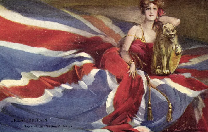
Artotype / Flags of Nations series – Most cards feature horizontal designs with women reclining on the appropriate national flag of the title. Note that the second United States design is a vertical format.
This series is remarkably difficult to define. The evidence suggests that one series of six was published on the British market and that a second series, which seems much more difficult to find) was published on the North American market. Only four unique designs have been seen in the latter series. It is possible that two further designs have not been found, but more likely that two of the European designs were duplicated in the North American series. First published circa 1907.
The finish of the cards includes a glaze which appears subject to chipping at the corners and edges, so these cards are very rarely seen in top class condition.
(Thought to be the British issues)
America – (horizontal design)
France
Germany
Great Britain
Japan
Russia
(Thought to be the North American issues)
America – (vertical design)
Canada
Ireland *
Scotland *
Note – * – Differ from cards of same title in Mansell series 1050
Artotype / Spirit of Liberty series – This series is believed to be a North American (only) issue. Until recently (1997) it was thought this was a singleton card. However, two other designs have now been seen with the same title, although details of these designs are ‘sketchy’ ! All cards seem to carry the same title (The Spirit of Liberty) on the front and feature women in US patriotic colours.
Publication date is undetermined, although the finish of the cards, which includes a glaze which appears subject to chipping at the corners and edges, suggests the period of 1906 to 1908.
(A) . . . . Woman in green leotard, draped in gauze in US colours.
(B) . . . . Horizontal – woman in blue, set on US colours
(C) . . . . Horizontal – no other details known
World War One Period
4192 – 4196 – WW1 period issue featuring patriotic / war sentiment designs, with titles set in a white band at bottom of the card. Note – only five designs have been seen by Barribal. It is not known whether this indicates a ‘missing’ card. Valentine normally published in sets of six. However, designs by other artists in a similar style and with proximate numbering suggest this may not be true in this case.
4192 . . . . Thoughts of you bring sunshine
4193 . . . . All for my hero
4194 . . . . I wish you were a soldier, Teddy
4195 . . . . When the boys come home
4195 . . . . An angel from Mons
4200 – Head and shoulder portrait of a woman, viewed from the side.
4200 . . . . Worth fighting for
World War Two Period
Two series of six designs by Barribal were published by Valentine in 1939 and 1940. Although there are several artists whose work has appeared on postcards over a longer period (Margaret Tarrant would be a good example) there are few (if any) whose production of new designs on postcards span a period of thirty seven years.
251 – 256 – Portraits (mainly head & shoulder) of women in war service uniforms. Published 1939.
251 . . . . . Duty calls
252 . . . . . Off duty at nine
253 . . . . . I love the farmers
254 . . . . . The “Boys” are wonderful
255 . . . . . Awaiting orders
256 . . . . . Roughing it
507 – 512 – Women in uniform in London streets or as theatrical (variety) performers backstage. First published 1940.
507 . . . . . Goodbye Piccadilly
508 . . . . . Eve takes a peep
509 . . . . . The troops are entertained
510 . . . . . Rules & regulations
511 . . . . . Siren calling
512 . . . . . The mask of fashion & …..
VICTORIA & ALBERT MUSEUM (U.K.)
Reproductions of old Theatrical designs – one an advertising poster and the other a program cover. Published in the late 1980’s and no longer in print – surprisingly hard to find !.
Box of Tricks – (Program Cover)
The Happy Day – (Advertising Poster)
WOOLSTONE BROTHERS (U.K.)
Only known card is a copy of original Inter Art 2875, D— It !, issued under the ‘Milton series’.
WORCESTER PRISONER OF WAR FUND (U.K.)
Picture of a woman and child on a hillside – images of soldiers in the sky above. Presumed to have been done by artist for his home town regiment in 1914/15.
By thought and deed
ANONYMOUS ISSUES
Three cards (non-advertising) which carry no details of publisher.
Head and shoulders of woman set in an Ace of Spades motif. Black & white design with minimal colour added. (WW1 period)..
Best of luck from the 12th Division
Similar in design to the Firkin Gloves advertising card. Seen PU in 1909 – possibly earlier publication.
(Woman in green, sheltering under umbrella)
Photographic greetings card, in which the design from International Art 1730, with purple hand tinting, is used as the backdrop.
(RP Greeting card – Woman in large hat as backdrop)
————————————————————————————————————–
ADVERTISING ISSUES (excluding Theatrical)
Note – All cards of British Origin unless stated
BASS MUSEUM
Modern reproduction of the Worthington advertising card (see below) set in white borders.
BEATY
Carlisle based publisher. Used Barribal designs as the basis of a series of generic laundry advertising cards. These carried laundry related slogans on the front and could be locally overprinted on the reverse for the individual laundry company. Three designs known. Earliest use seen to date – 1907.
Linen of snow white hue….. (Maid changing bed linen)
Good cheer doth gain an added zest….. (Maid setting table)
These curtains are a tribute rare…..
H.S. & S. Ltd.
Features a woman opening a bottle of water. Square vignette with black borders. Visually unlike most Barribal designs.
Jewsbury & Brown Lithia Water – captioned “Look Out”
JAMES HENDERSON & SONS LTD
Two advertising designs for Oddendino’s Family Restaurant. Both are reprints from Henderson C5 series, attached to menu cards and overprinted with Oddendino logo.
Wearing of the Green (Oddendino advert)
True Blue (Oddendino advert)
FRANK SMITH
Seated woman with book in lap. Card is numbered 128538.
Barnet helps for beginners in photography
VALENTINE
Advertising designs created for the Franco-British Exhibition of 1908.
Woman wearing tricolour cap, with bulldog
Two women wearing large hats
From a series of plain back, sepia toned reproductions of poster advertisements, the Bass/Worthington advertising design. Published circa 1940.
I prefer a Bass (Valentine repro. series)
JOHN WADDINGTON
Advertising design created for Bass and Worthington beer. Features a head and shoulder study of a ruddy-faced older man.
I prefer a Bass
I always have a Worthington
WYKEHAM
Lady reclining, smoking and reading a book. Numbered 453.
Players Navy Cut Cigarettes
ANONYMOUS ISSUES
Red haired woman, orange coat, blue feathered hat and collar, brown gloves, in a winter landscape. Horizontal design. The Firkin’s Gloves script is in a large font but printed very faintly on the card.
This card has been seen postally used in 1904 – but had an undivided back, which dates publication as circa 1902, making it clearly the first Barribal design issued as a postcard. It is worth noting that the advertiser was based in Worcester – Barribal’s place of birth.
Firkin’s Gloves
—————————————-
Designs commissioned for the London International Horse Show of 1911 and 1912..
Seated woman, male standing behind – stadium as backdrop
International Horse Show – 1911
Woman on horseback, set in pink framed oval vignette. Second card is essentially the same design, but set in a brown frame and with minor detail changes.
International Horse Show – 1912 (Pink Vignette)
International Horse Show – 1912 (Brown Vignette)
—————————————-
Italian printed advertising card for cigarette manufacturer.
Teofani Cigarettes (advert)
—————————————-
A plain back advertising card for the printers – Thomas Foreman and Sons of Nottingham. Vertical design with rectangular vignette showing a Woman with a Bulldog. “British” embossed at top. This design was originally used by Nottingham City Council as a greetings card to serving soldiers from the city, Christmas 1916.
The Winner (advert)
—————————————-
Two head and shoulder portraits of women, set side by side on a horizontal card. Advertising data printed on reverse. Card published on thin board. This card may have been produced as a generic advertising card – but we have only seen used for Westminster, a BAT brand sold in Holland)
Westminster Cigarettes (advert)
————————————————————————————————————–
THEATRICAL ADVERTISING ISSUES
The design of advertising posters for theatrical productions was a significant element of Barribal’s work in the latter part of the first decade and the early part of the second decade of this century.
The majority of these designs were commissioned by David Allen, a Belfast & London based printer who specialised in theatrical advertising. Three designs were also done for John Waddington of Leeds. These were to prove significant to the artist, as this company became his major source of income throughout the 1920’s and 1930’s, primarily from designs for general advertising posters and for playing cards, an area in which Waddington held a dominant market position.
DAVID ALLEN
After the Girl
Autumn Manoeuvres
Broadway Jones *
Gipsy Love
Mr Oscar Asche as ‘Hajj’
Half Past Eight
Little Bit of Fluff
Peg o’my Heart
Quinlan Opera Company
The Count of Luxembourg
The Dancing Mistress (i – Couple in Aeroplane)
The Dancing Mistress (ii – Woman Ice Skating)
The Girl in the Taxi
The Girl in the Train (i – Woman in black hat)
The Girl in the Train (ii – Couple Dancing)
The Girl on the Film
The Joy Ride Lady **
The Man in Dress Clothes
The Marriage Market
The Mikado
The Naughty Wife
The Quaker Girl (i – Quaker girl & man in trilby)
The Quaker Girl (ii – Quaker girl – inset letter Q)
The Quaker Girl (iii – Seated girl – book in lap)
The Sunshine Girl (i – Girl shielding eyes in sun)
The Sunshine Girl (ii – Spanish dancers)
The Whirl of the Town
Tonight’s the Night
Who’s the Lady
(From “Suzette” – portrait of Gaby Deslys)
(Note – * – name of play appear only on reverse)
(Note – ** – card also seen used as an advert for the printers, offering to take over printing formerly done in Germany and Austria – presumably at the beginning of World War One.)
JOHN WADDINGTON
Joy Bells
Missy Jo
The Gyps Princess
APEX PRESS
(From “More” – portrait of Alice Delysia)
ANONYMOUS ISSUES
Box o’Tricks *
(Note – * – seen only with an advertising text (non-postcard) reverse)